Projects
Research
& UI/UX Design
&
Blinkit (prev. Grofers) (Senior IC)
Reimagining grocery shopping experience for an express delivery service.


Situation
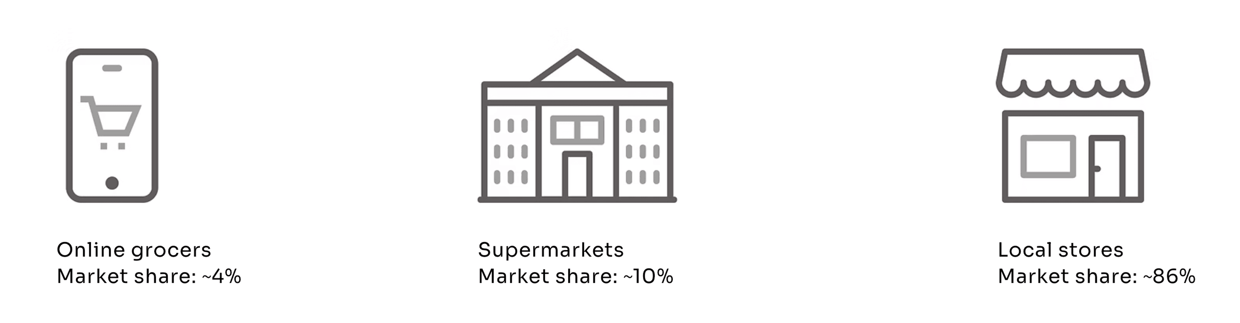
Grofers is one of the biggest online grocers in India. Online grocery has been around for ~10 years in metro cities in India and still the combined market share of all online grocers in the sector has barely crossed 4% in a decade. Reason being - hyperlocal stores offer a level of personalization like no organized player. They not only have a near-ideal assortment that caters to their area of operation, but are also able to provide home delivery services at no longer than 30-45 minutes.
Challenges
How do we design an online shopping experience that helps us compete with hyperlocal general stores?
it needs to be express;
it needs to be reliable & convenient;
it needs to cater to users' specific assortment needs
Resolution
UX Research
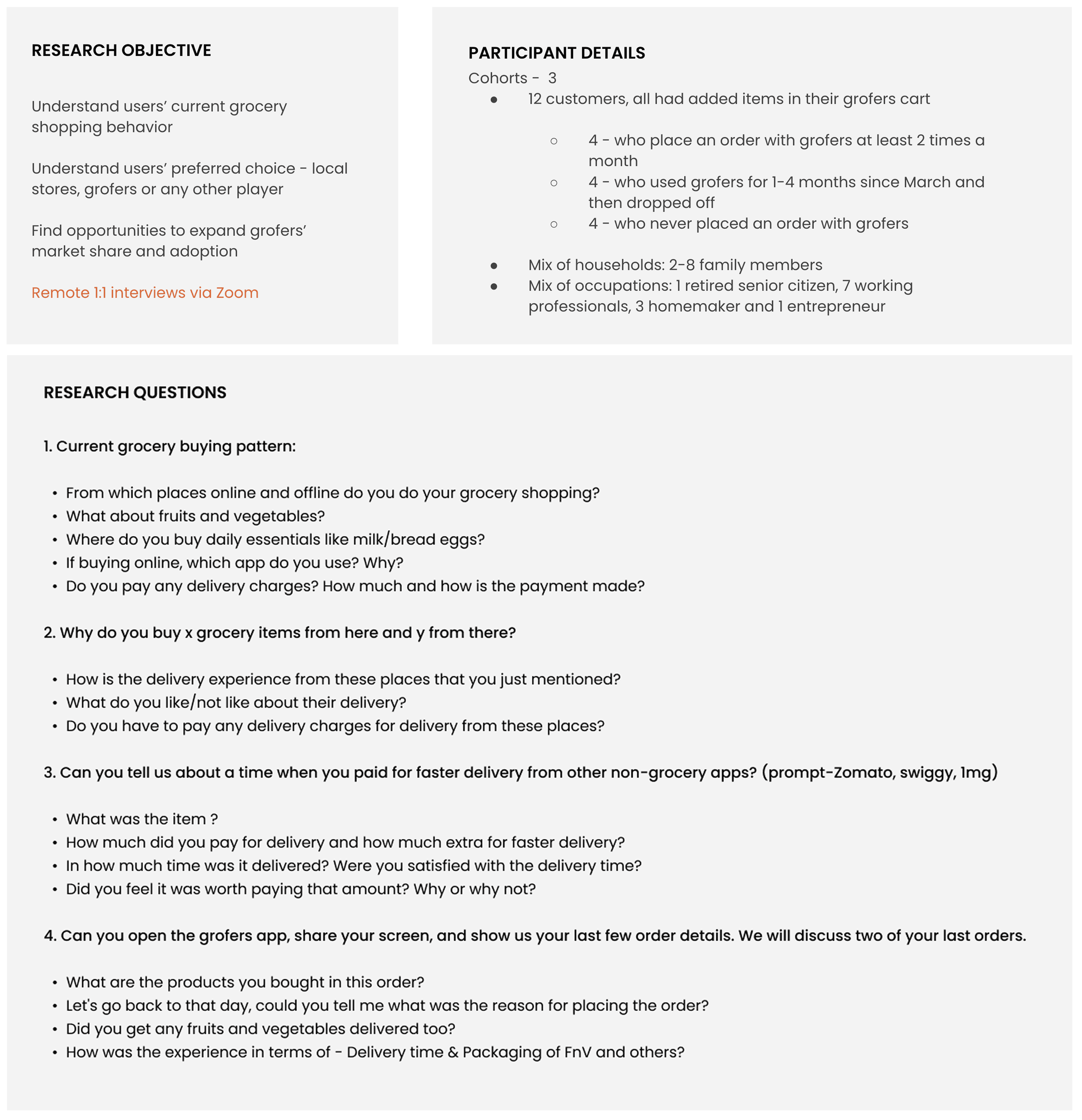
Since March 2020, online grocery segment saw an influx of a huge number of new customers. But, in a few months, things started to go back to pre-lockdown level - retention dropped, acquisition dropped.
We wanted to understand why this behaviour change was not sustainable? What were the factors that people still preferred to shop offline? So, I collaborated with a UX Researcher on our team and organised user interview sessions.
Insights
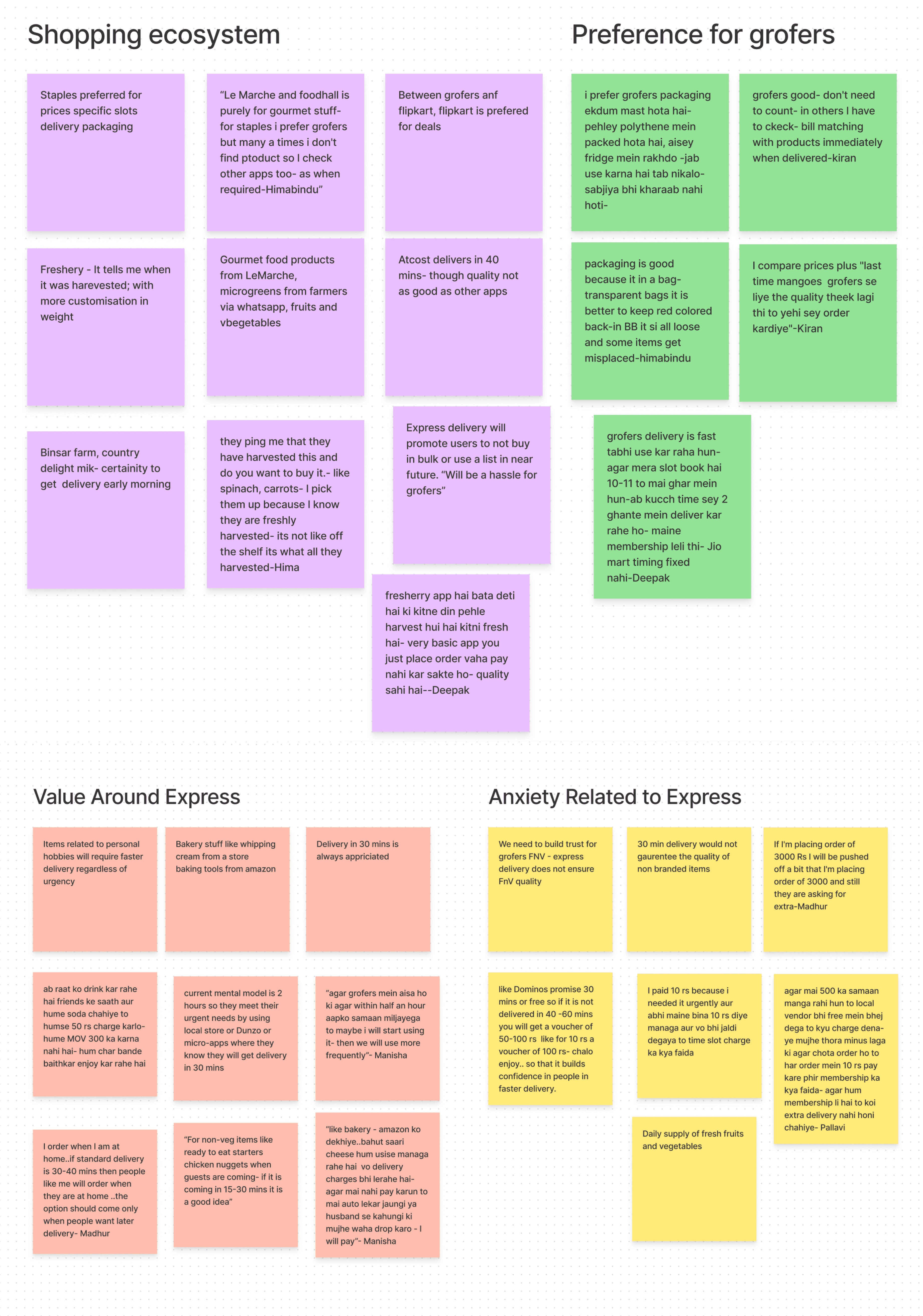
Grofers was preferred over other online players because of: Lower prices & On time delivery
For all participants, fast and free grocery delivery for urgent needs meant top-ups from neighbourhood store
For Fresh assortment, participants preferred:
Local stores,
Micro-apps delivering just fresh produce,
Organic farmers via whatsapp and Instagram
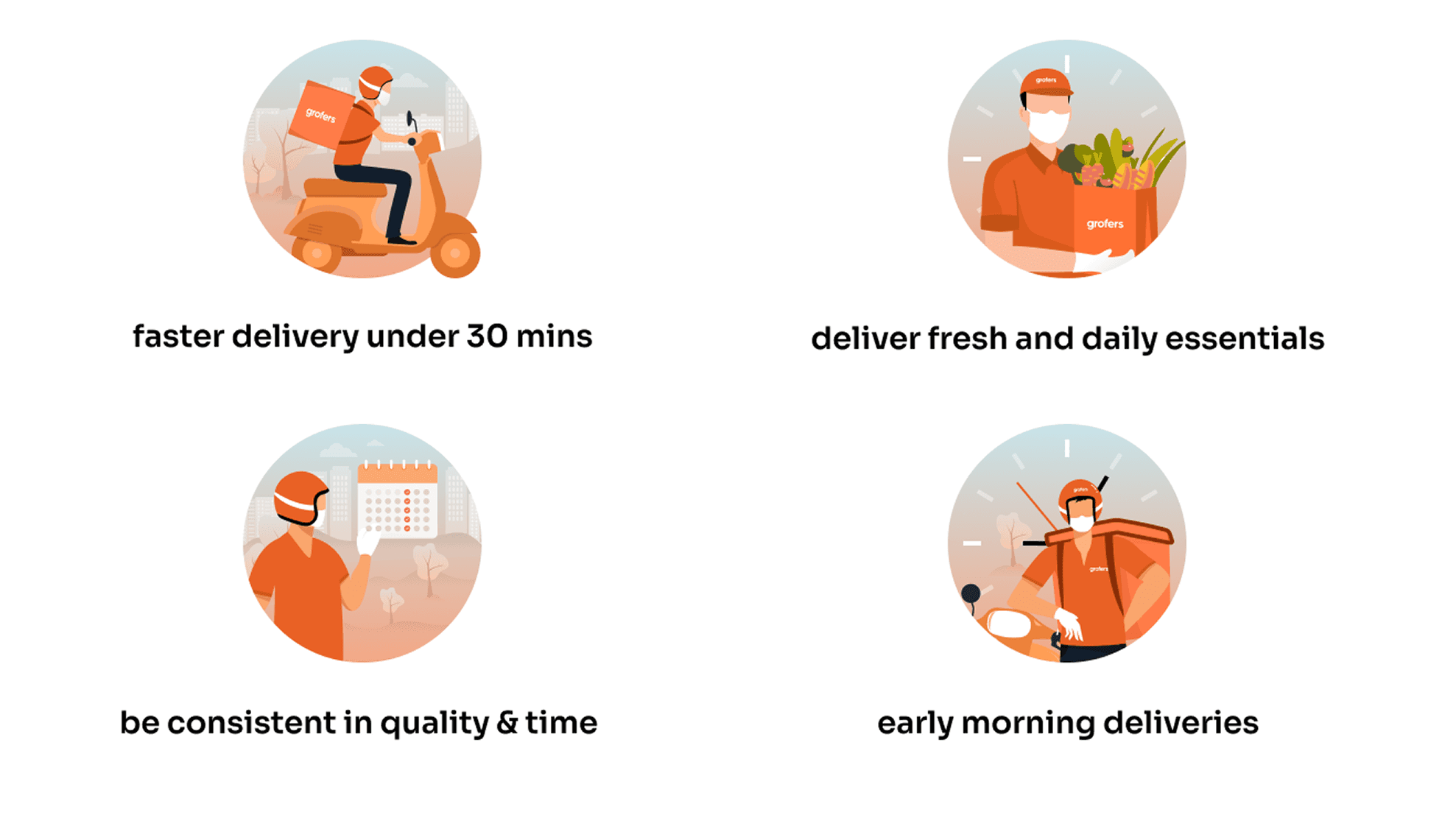
A few of the customers were ready to move to Grofers if they could trust our product quality (esp. fresh) & if we could provide convenient early morning delivery time & faster delivery within 30-40 mins.
Going back to our problem statement - How do we design an online shopping experience that helps us compete with hyperlocal general stores?
Designing for Express Delivery
Delivering everything under 30 mins (or 15 mins as we aimed at) meant it was time to update the app experience to be in alignment with the proposition of Everything @ Express. I sat down with two Product Managers in our team to break it further down & define touch points in the user journey where we needed to make changes.
We figured two key factors in this redesign would be - becoming express & building trust.
Becoming Express - we needed to make it simpler and faster for our users to add and checkout items
Building Trust - Introduce the new service properly and keep the users informed of the order status since we are catering to their urgent needs as well, hence we needed to bring in live order tracking too.
1. User onboarding - Introduction to the new service
Grofers has always been positioned as a brand that helps customers save more with its guaranteed lowest prices. Now, to introduce our customers to the inclusion of a new and more exciting proposition of express delivery, I redesigned the onboarding flow.
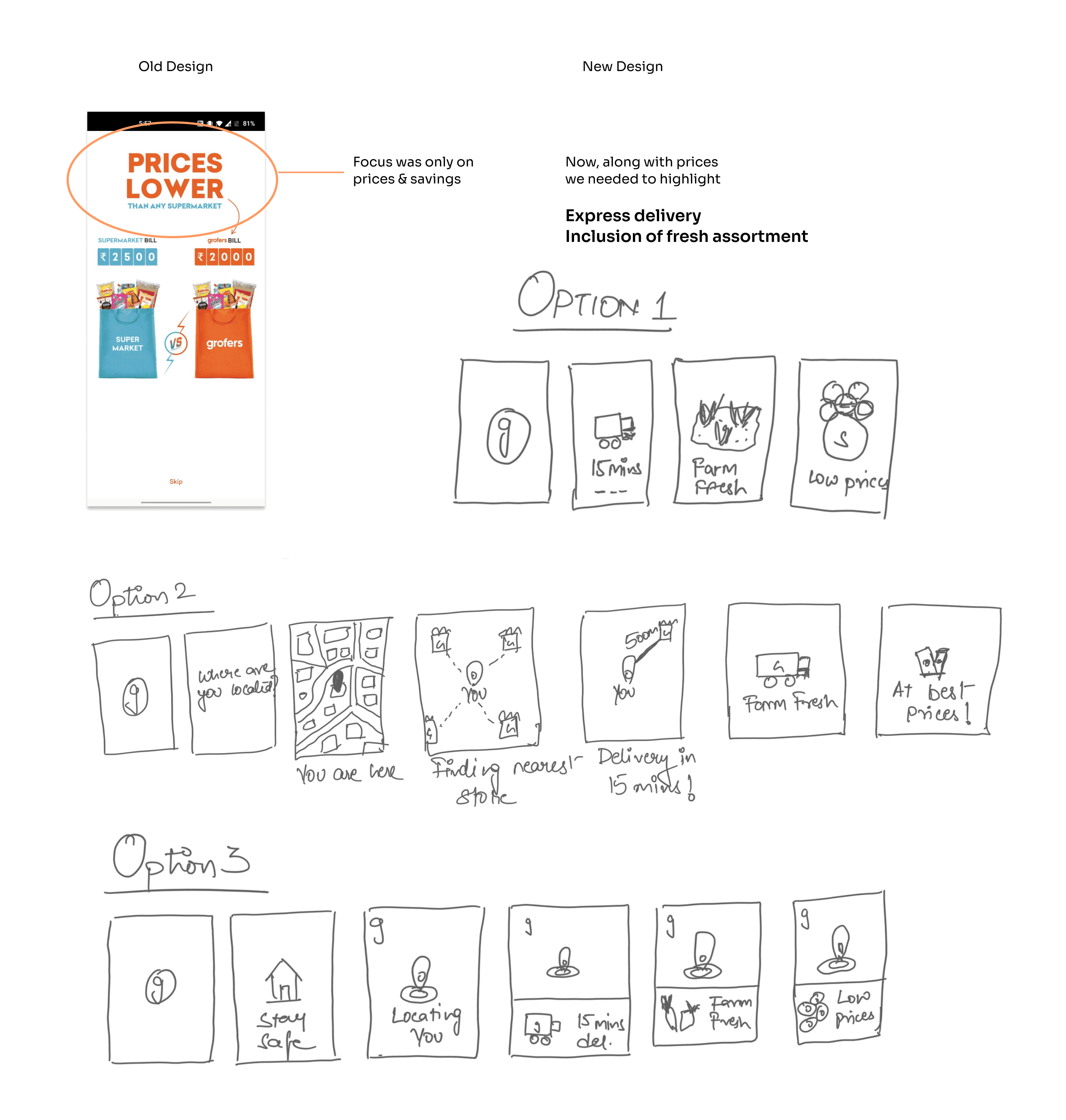
I tested out these 3 flows using a low-fi prototype with 8 internal users and option 3 was the most comprehensible - liked by 5 of them; the other 3 users preferred option 1. Why Option 3?
Because it started with the right context - that you may order your groceries while staying safe at home.
Earlier, the flow was : Splash --> Onboarding --> Location fetching --> Home
A user would see a loader after onboarding which wasn't the best experience so I combined location fetching in the onboarding to give a more seamless experience to the users.
Splash --> Onboarding --> Home
And lastly, all 3 propositions are well conveyed with enough focus.
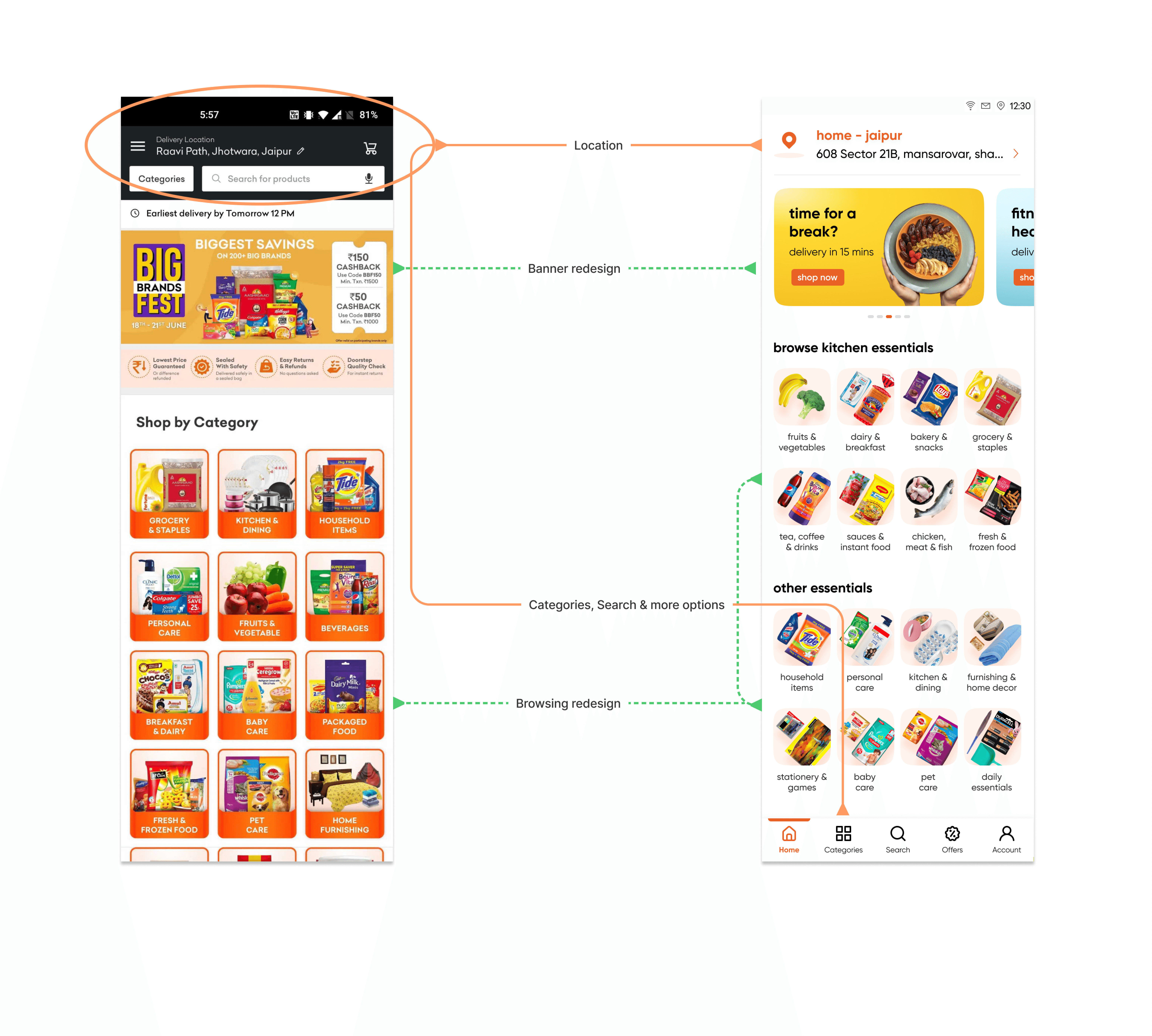
Easier navigation find and add items quickly
Now the second challenge was to make app navigation so simple and intuitive that it only takes a couple of minutes to build and checkout the order. In the old design, everything - categories, promo banners, offers, collections etc. was on a single page called feed and everything else was hidden in the hamburger menu.
We conducted an A/B experiment around how our navigation should be like.
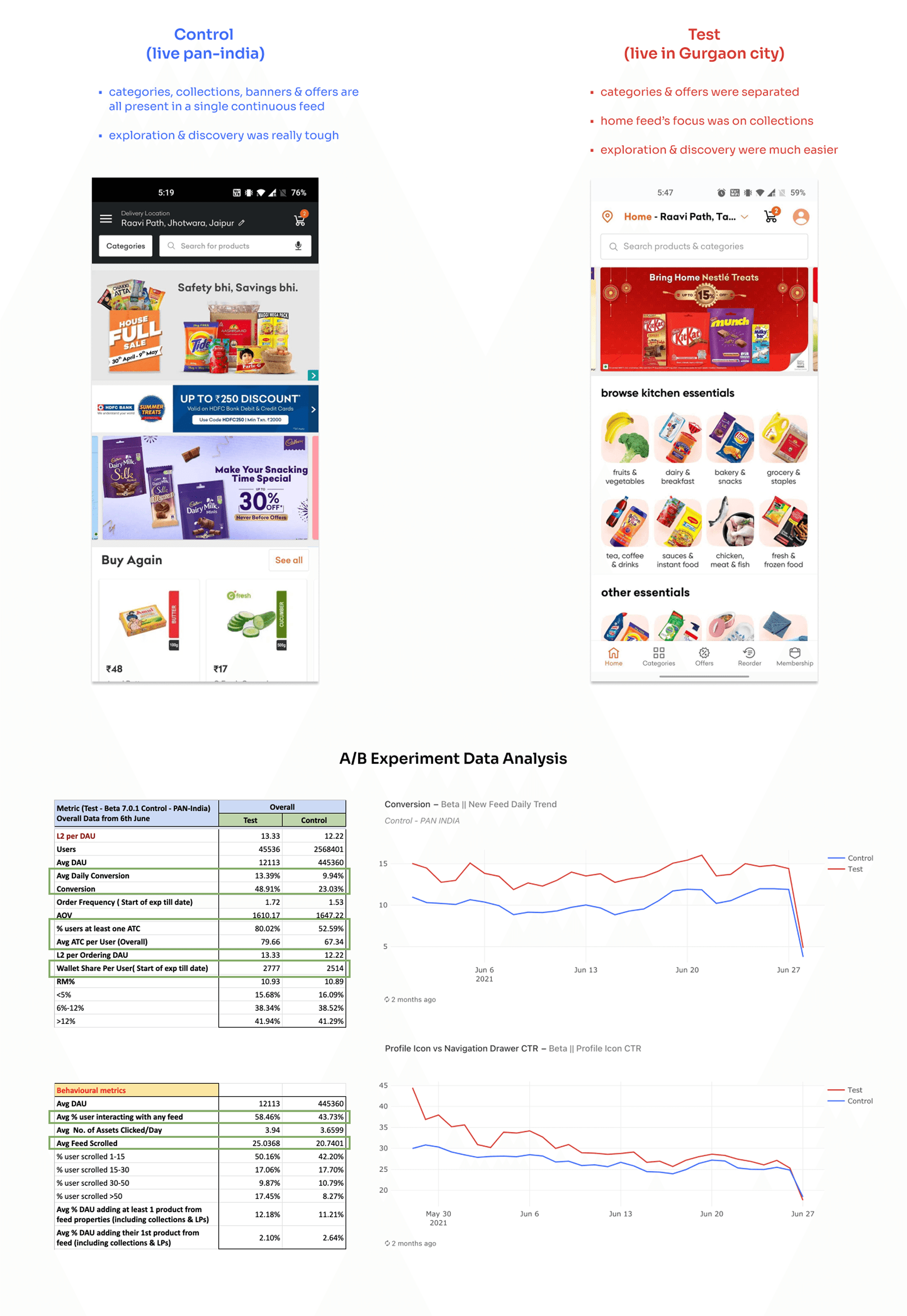
No observed parameter showed a decline in Test feed but 3 parameters showed significant improvement -
Conversion of Test was more than double as compared to Control - ordering was easier in Test feed
Additions to cart were 10% more in the Test feed - finding and adding items to cart was easier
Users' interaction with the feed was 15% higher in the Test feed - exploration & discovery was easier hence, impulse purchasing was also observed resulting in a higher wallet share
We conducted 2 more A/B tests on the new feed to arrive at the exact combination of bottom navigation options - Home (collections), Categories, Search, Offers & Account.
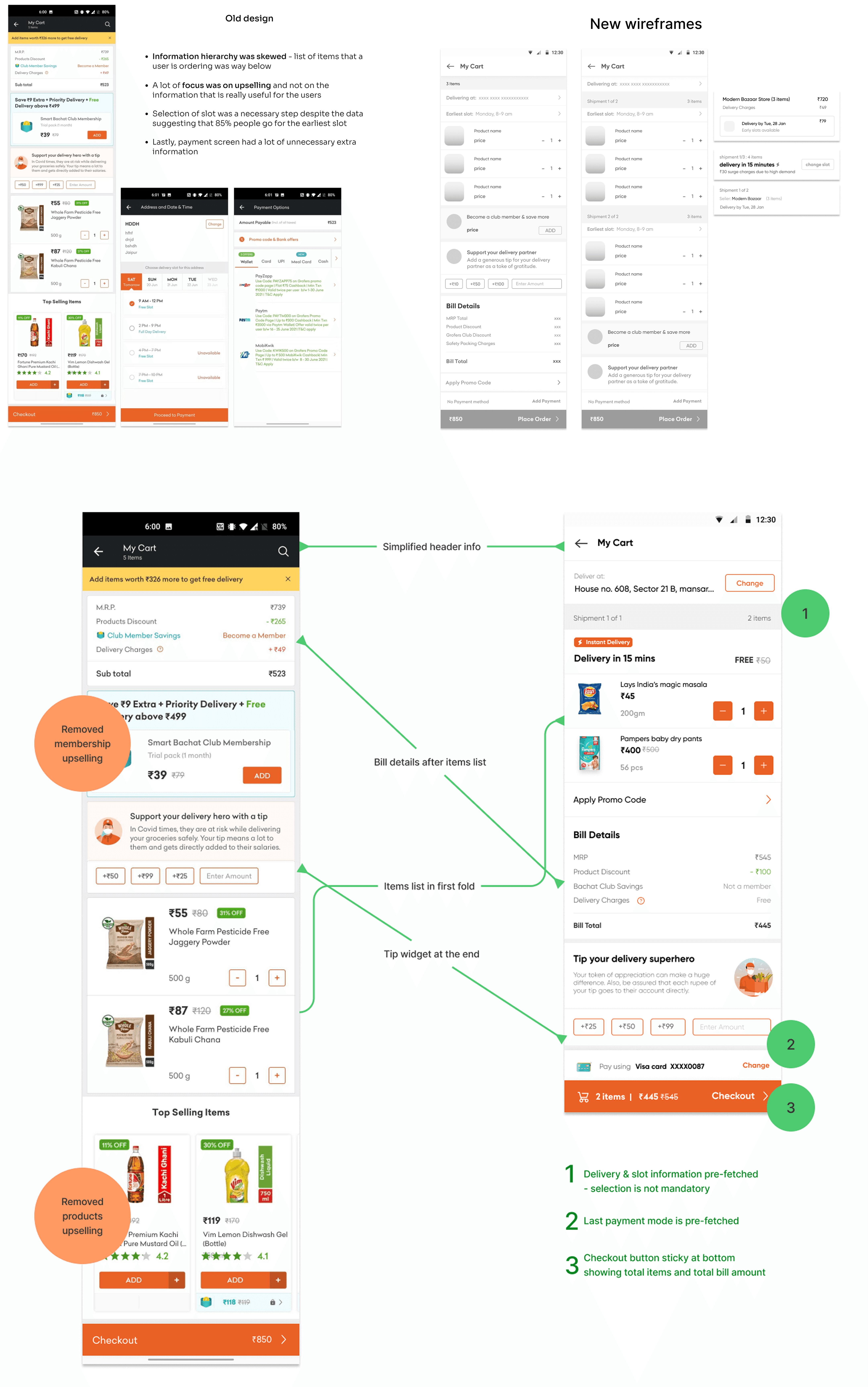
3. Faster checkout - place order in as few steps as possible
After making addition of items easier, the next step was to make checkout easier - which was a 3-step process in the earlier flow. We started off with the vision of making it a single-click checkout for repeat users. Wireframes focus areas - improving information hierarchy and reducing the number of steps
4. Live Order Tracking
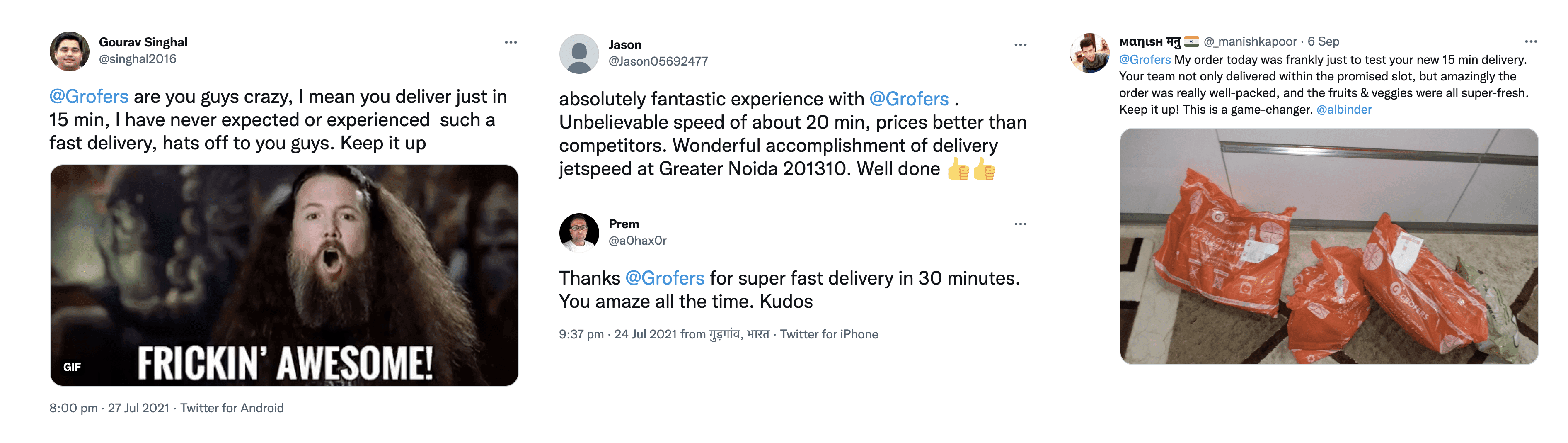
A delivery service as fast as 15 minutes not only sounds very exciting & unbelievable but also creates some anxieties. What if its not here in 15 mins? Do I contact customer support? Is it even possible? And a lot more!So, it was very much needed to provide a transparent and real-time view of what's happening behind the scenes - so that our users remain at peace.
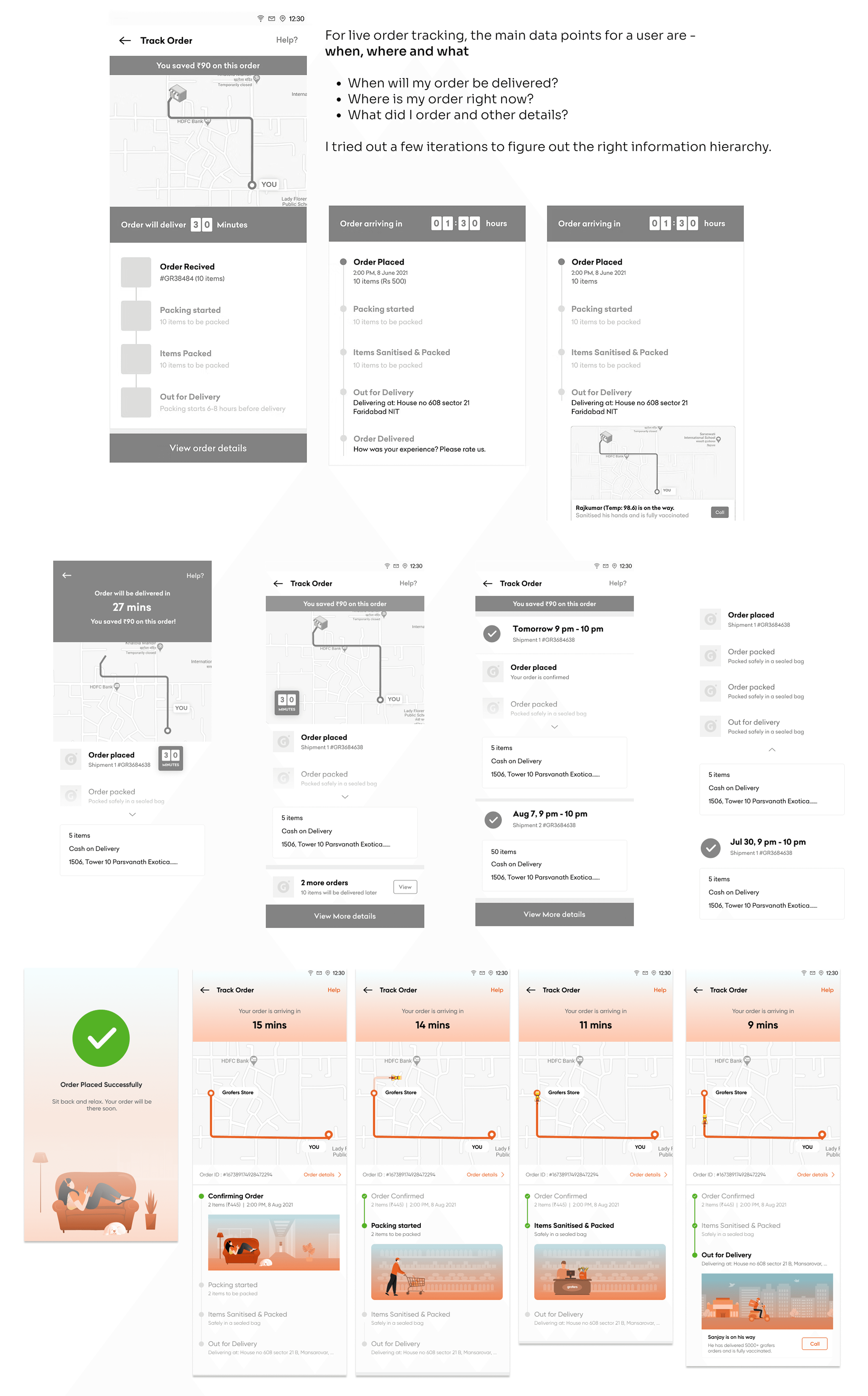
Usability Testing
I prepared a final prototype to test out if we succeeded in making ordering & checking out easier or not. And also, to get feedback on the new feature of Live Tracking. Again, I collaborated with the UXR in our team and we organised a moderated usability testing session with 8 users who all order regularly from grofers and have been our users for over a year.
We asked the users to perform a variety of tasks like -
Add 2 items from the home tab
Search for 2 items and then add to the cart
Add 2 items from 2 different categories
Find ICICI bank offer code and apply
Change address on cart page
Change payment mode on cart page
Place order
We recorded these sessions, users' behaviour, changes in expressions and asked a few follow up questions after each step.
Findings
Users who had already experienced express delivery were delighted.
Others were excited about the proposition as they'd be able to purchase urgent items quickly.
6/8 users had apprehensions about their bulk/monthly orders as they are used to selecting a specific slot and getting all their items based on - when the user will be available at home to pick and check the items
Users showed positive response towards live tracking in grofers application since express delivery will mostly be used for urgent orders and they can track where their order is.
Most participants were willing to pay for faster delivery if there were an urgent grocery, beverages or speciality cooking needs
Results
More Projects


