Projects
Creative Direction
& UI/UX Design
&
Razorpay 3.0 (Senior IC)
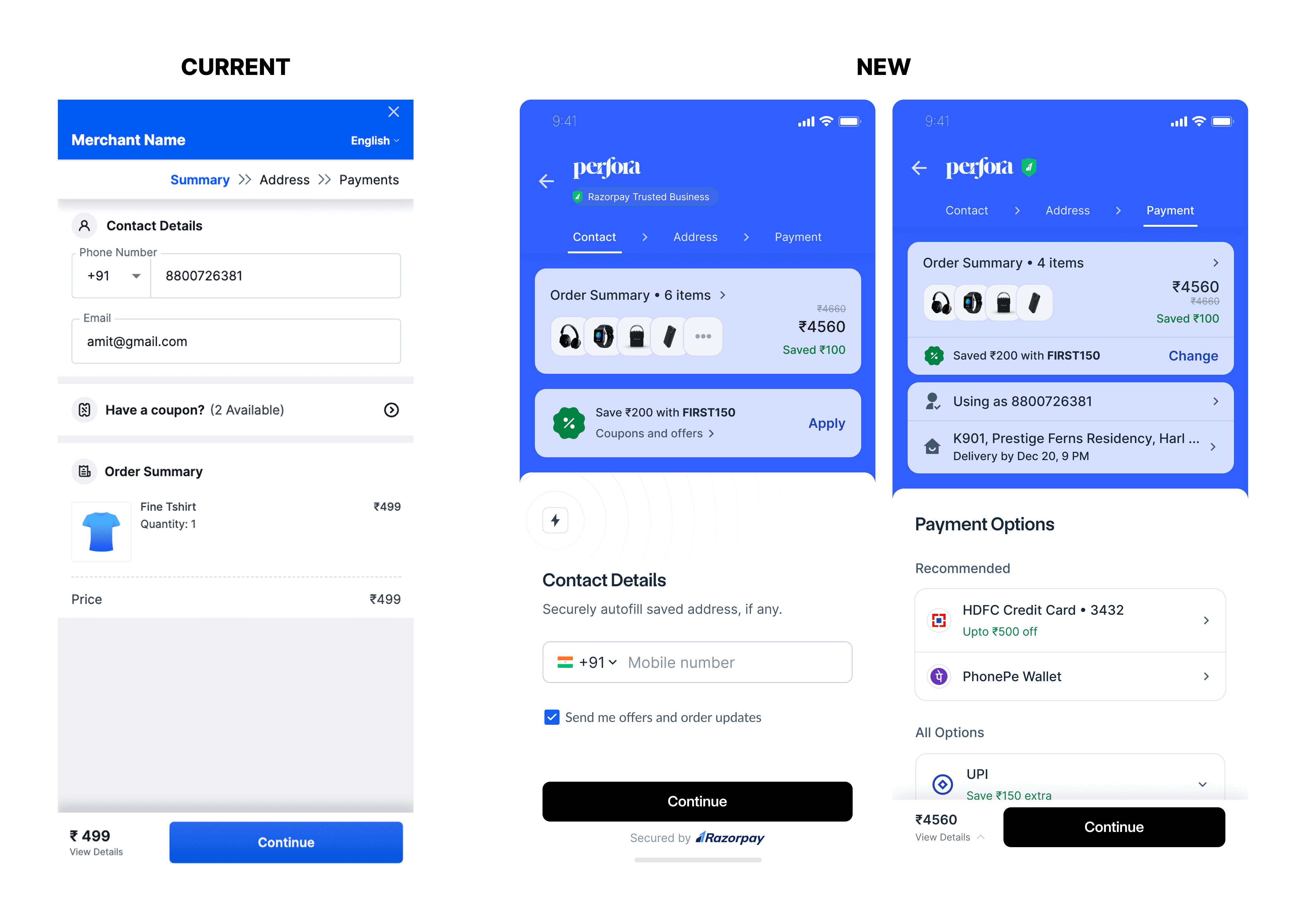
In today's evolved digital landscape, consumers want a fast and seamless purchase journey; merchants want a reliable, efficient and easy to integrate checkout. With this in mind, we redesigned the Razorpay checkout with focus on - SPEED (1-click checkout), winning TRUST for the first time visitors and building a COHESIVE purchase journey from start to end.


Situation
Razorpay 1.0 was launched in 2014 and it was a simple checkout back then - a list of most common payment methods mainly Credit card, Debit card and Netbanking. But as the digital payments landscape grew, so did the complexity - focus shifted from cards to UPI first, more wallets, UPI apps, coupons, reward points etc. And at the same time the number of online buyers as well as their expectation to have simpler and faster checkouts grew too.
With no design system, no clear vision and a minimal emphasis on UX, the Razorpay checkout experience started to no longer feel simple.
The Catalyst for Change
Despite numerous discussions on revamping the experience, the team couldn't get anywhere because there was no clarity on why we need to revamp, what problems to tackle first or how to go about it.
I spent the first 3 months to understand the complexity of the existing product and the needs of the consumers as well as the merchants at that point. I led the efforts of conducting a comprehensive audit of our product, meticulously mapping out every screen and workflow. Using this audit, I created a visually striking collage that showcased the diverse array of designs within our product, highlighting the fragmented nature of our offering and the resulting confusion for our users.
Opportunity Hiding in Plain Sight
Looking at all the screens and flows above, it was quite clear that we need to bring in some consistency in our product but still it wasn't a compelling enough reason to aim for a full-fledged revamp.
So, we started digging deeper. We spoke with the sales teams, we looked at previous research and data of our repeat users, their behaviour, their complaints and expectations. While going through all this, an opportunity jumped at us -
More than 95% of our users interacted (directly or indirectly) with Razorpay~5 times in a month - meaning most of us are already locked in the Razorpay network.
Each transaction took almost 90-120 secs to complete even for a repeat user whereas it was sometimes as high as 4.5 mins for a new user.
So, if we have 95% repeat users - can we not retrieve their data faster and make their journey more seamless and satisfying by providing enough personalisation? Also, this will allow Razorpay to deliver a repeat buyer experience even to new users.
Challenges
Getting a dedicated team to lead these efforts because we were targeting some big feature launches that year and didn't want the revamp to derail those.
There were some 100+ files and 10+ ex-designers who had worked on the product before us with no Knowledge transfer on how and why certain decisions were taken.
Checkout is a highly technical and legal product - there are a lot of changes that we cant make because they are under certain regulations or not technically feasible - but there was no clear guidance or documentation around these.
Merchants main demand was to have a fully customisable checkout - continuity of experience.
Resolution
Creating a Shared Product Vision
After securing buy-in from multiple departments and leaders, the design team was empowered to solve this complex problem. On a high level, we were in agreement on why we should revamp but, it was crucial to have a clearer vision for the product's direction and ultimate goals to make it more tangible and feasible to achieve.
Taking initiative - Lets get everyone on the same page
I organised a cross-functional workshop inviting the PMs, engineers, marketing and sales people to align on our goals for the revamp and to gather their insights and build a massive list of potential problems we can solve for.

Mapping out the buyer journey - finding UX blindspots
Using insights from our research, we then mapped out every stage of the buyer journey, including our user's needs, pain points and frustrations. Then we asked ourselves, "What would it look like if we took all of the low points in this journey and elevated them?" This process enabled us to step back, see the big picture, and identify potential areas for growth and improvement.

Where do we stand in today's landscape?
Razorpay enjoyed a very comfortable position as a top choice for startups and small businesses since its inception but that changed post 2020 when a lot of new players with faster execution and better experience entered the market. So, as a natural next step we brutally compared ourselves against the other top players and did a detailed competitive and heuristics analysis.
Ideas are easy. Strategy is the hard part.
Strategy: How Do We Get There?
What do we focus on?
After gathering all insights, problems and prioritising them diligently - there was a lot for such a small team to handle. So, we decided to focus on rethinking and building the core journey as one project and run simultaneous smaller projects that help revamp secondary flows like - offers, UPI, affordability etc.
Refining and evangelising the vision
I’m a firm believer in transparency and collaboration. Instead of waiting to share the vision when it was “finished", I chose to be as transparent and iterative as possible while creating it. For 10 weeks, I shared weekly updates, progress, and ideas in a public company Slack channel where anyone could see them. This built tremendous excitement throughout the company and also allowed creating the vision to be a collaborative effort.
Getting the team together
With limited resources, we couldn’t build a new app from scratch. We had to prioritize, releasing changes gradually to support our existing users while evolving the product. I partnered with my Product and Engineering counterparts and built a dedicated team of 2 designers (including me), 1 PM and 8 engineers who worked together as a unit. This helped us get focused efforts on revamp project without affecting the BAU tasks a lot.
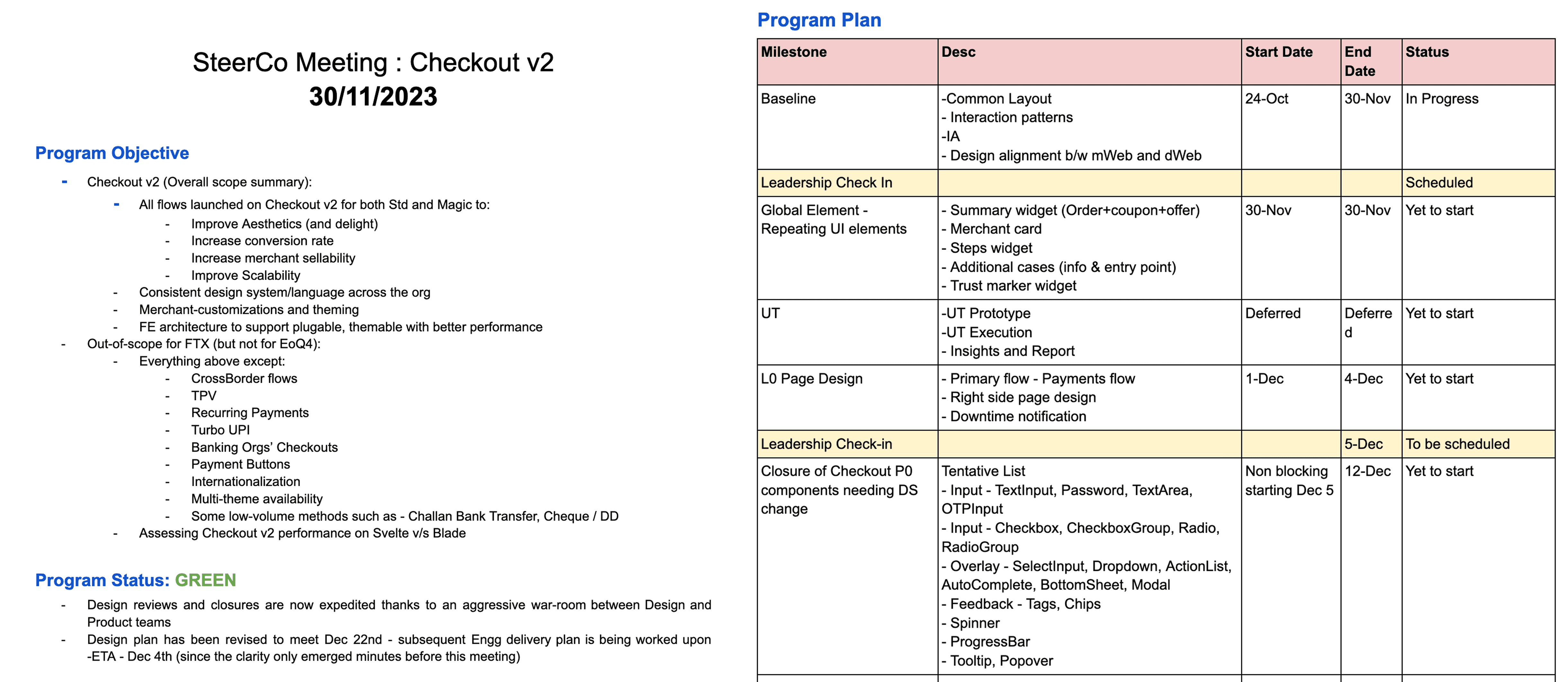
Monthly Steerco Meetings
In such a big project, getting the right guidance at the right time is very crucial. Through regular close collaboration with leadership, I made sure there were no major disagreements or revelations at the end of the project that could derail the entire thing. Building the vision and aligning everyone to it was as crucial as getting the right feedback to keep the vision alive and updated.
Execution: Making the Vision a Reality
UX & UI - story of two parallel tracks
For such a big revamp, it was imperative to separate out UX and UI tracks to think individually about the best outcome in each and then merging them. We needed the best functional experience as well as a new, more modern and relevant to the times design language to enhance that experience.
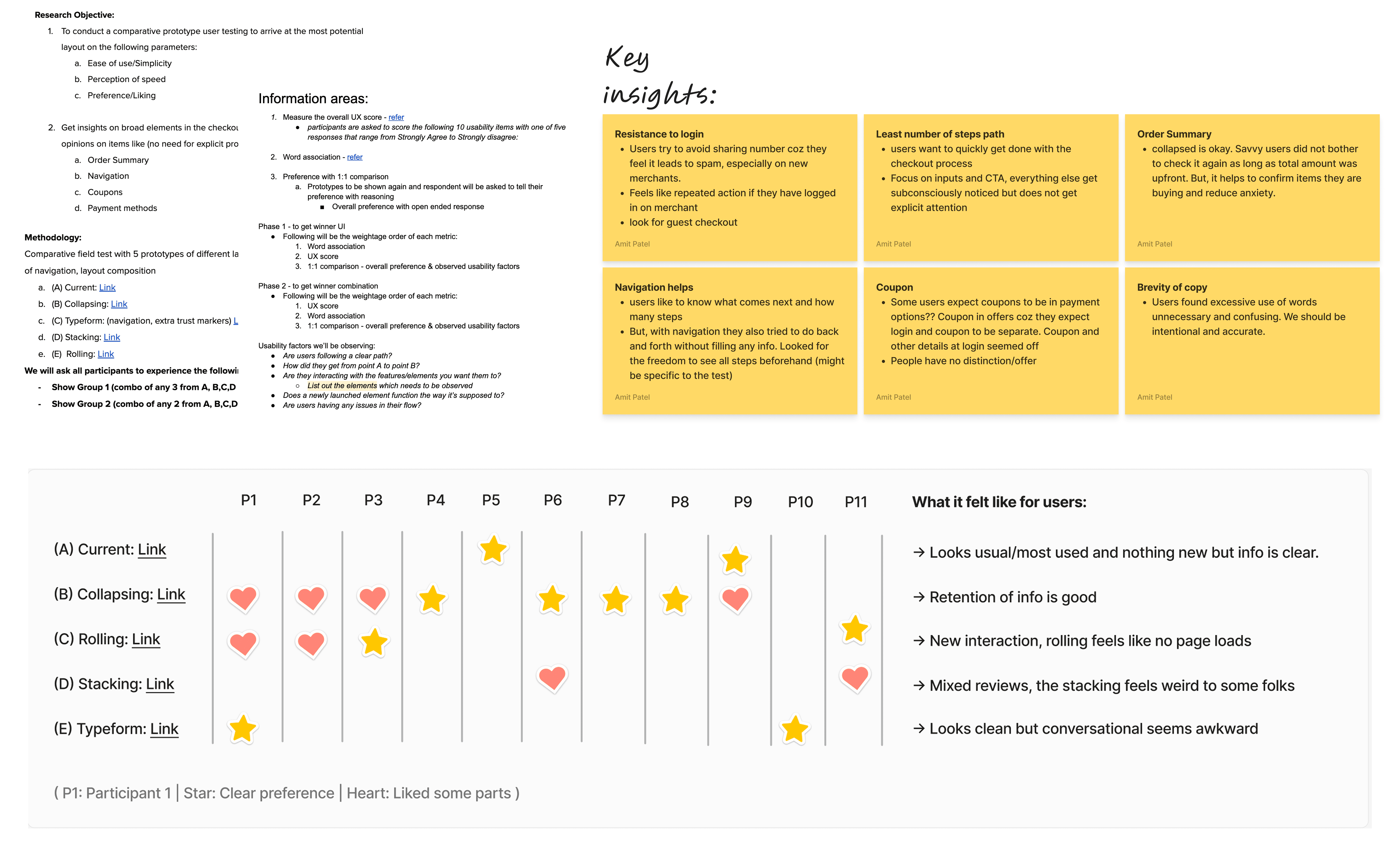
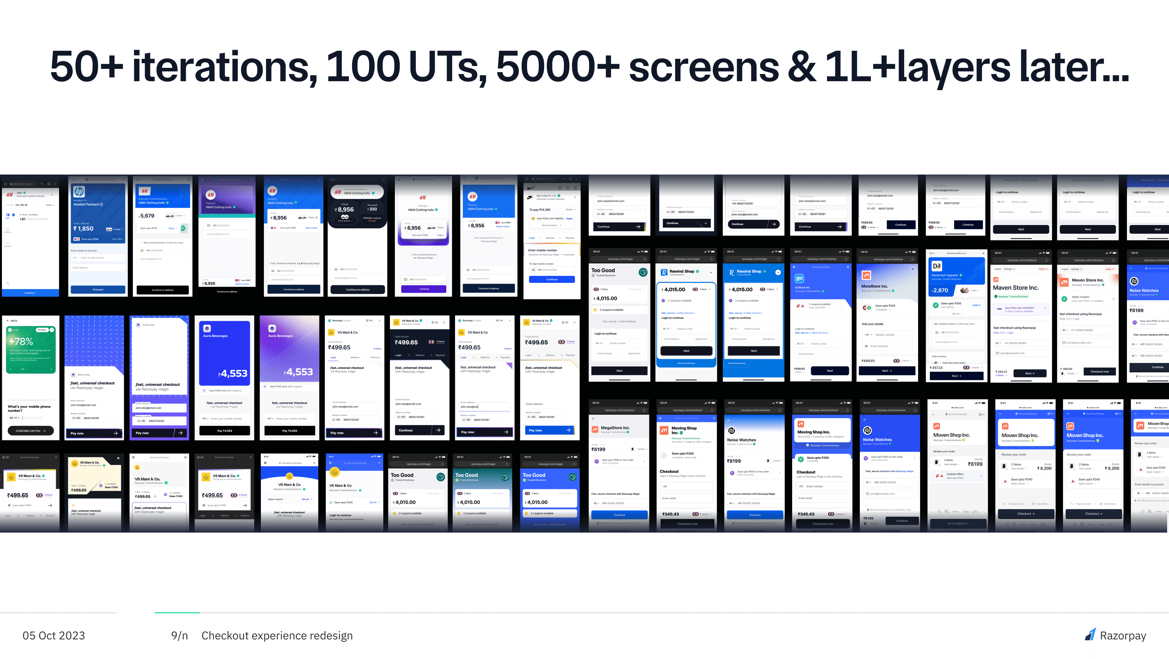
We built and tested the most promising layouts of the core journey with end users as well as merchants.
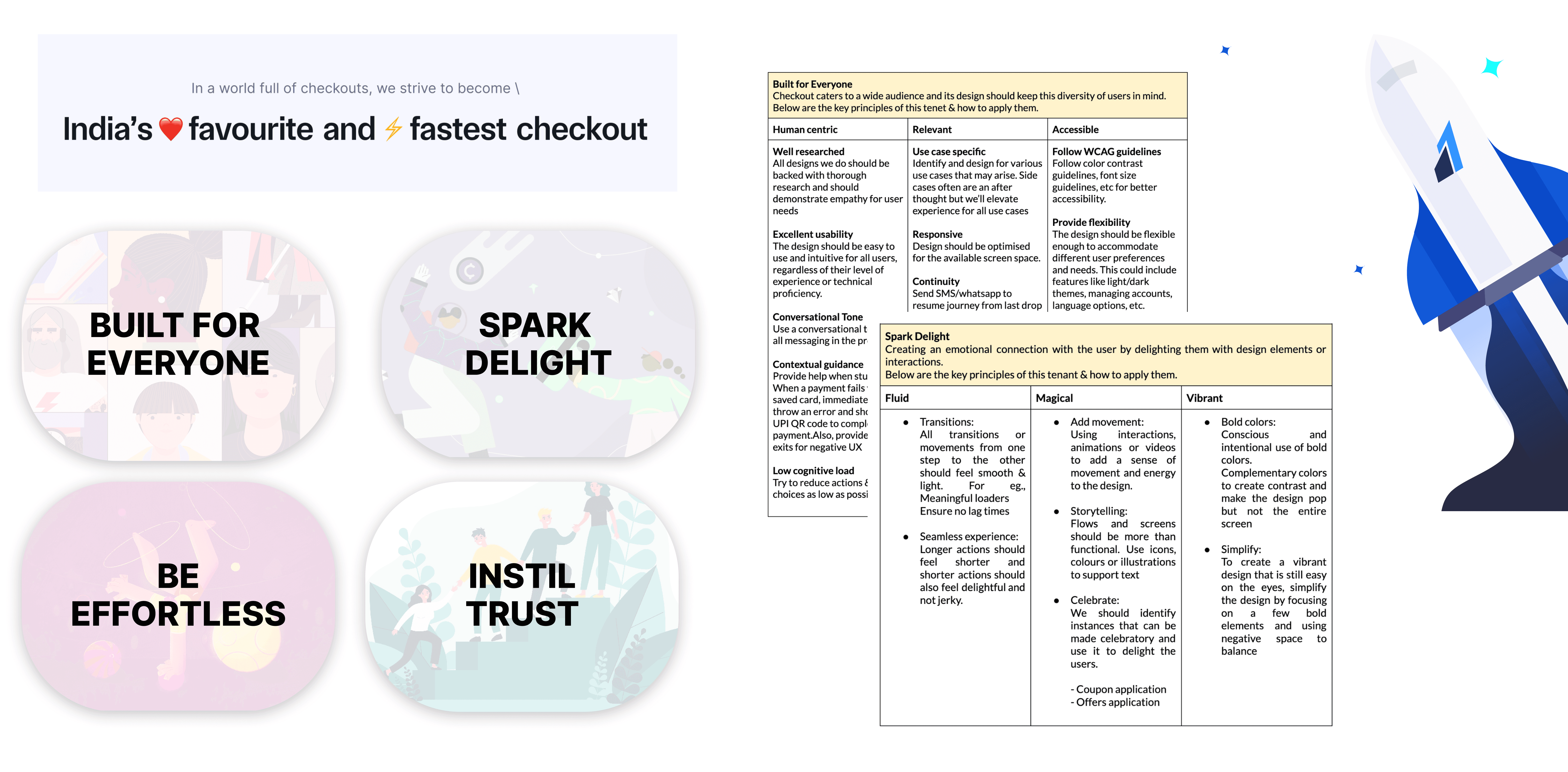
We defined our design goals and new language
Results
You may read more about the launch in detail here. Highlighting the most impactful results -
Razorpay checkout 3.0 is 5x faster as compared to other players taking shoppers from cart to confirmation in under 9 seconds (for repeat users).
Initial testing with 100 merchants showed 30-50% higher revenues.
Fully customisable buyer journey has led to a boost in conversion rate by as much as 40%.
More Projects


